UX Design
Brand Identity
Content Strategy
Student Project
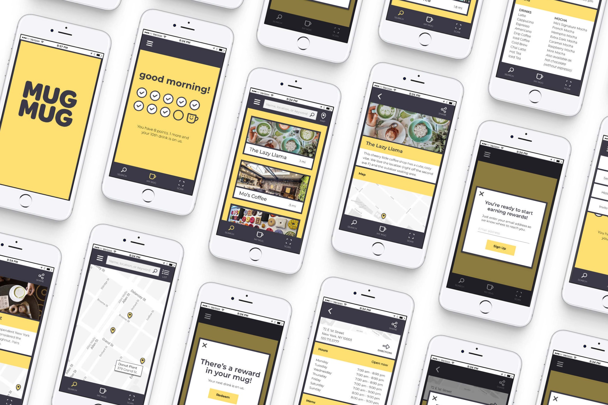
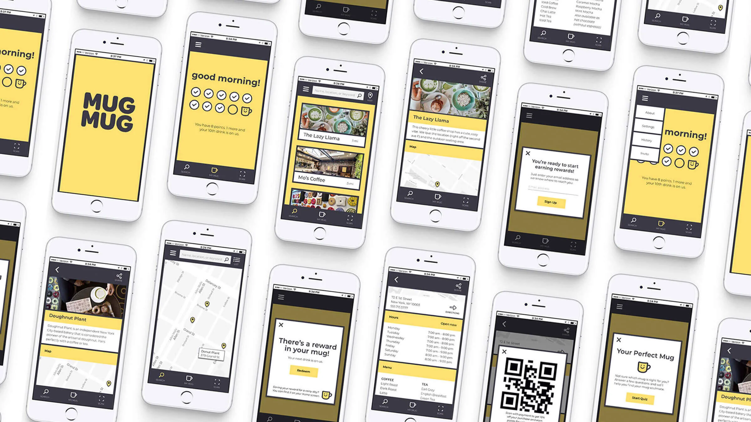
MUGMUG is an app designed to reduce cup waste. MUGMUG makes it easy to search for sustainable businesses and uses a punchcard-style points system to reward users for bringing their own containers to coffee shops.
the PROblem
Humor me for a second: how many paper cups do you think NYC throws away every day?
Seven million. Every day. That’s over 2.5 billion per year, just in NYC. Globally, we go through an estimated 600 billion paper and plastic cups each year. Using a disposable cup every day generates about 23 lbs of waste and 87 lbs of CO2 in a year.
What can a caffeinated person do?
Bring a mug. It takes just 15–24 uses for a glass, plastic, or stainless steel cup to be more energy efficient than its paper counterpart.
So, if it’s that easy to make an impact, why don’t more people do it? And what could get them to start?
The idea
There are dozens of customer loyalty apps and plenty of programs encouraging waste reduction. What if these two concepts were combined?
When I first had the idea for this project, I almost wrote it off as too obvious. Of course there would be an app (if not several) that rewarded users for cutting back on cup waste. After doing some research, I realized that was not the case. Lots of coffee shops reward users for bringing their own cups, but they all do it in different, analog ways.
USER RESEARCH
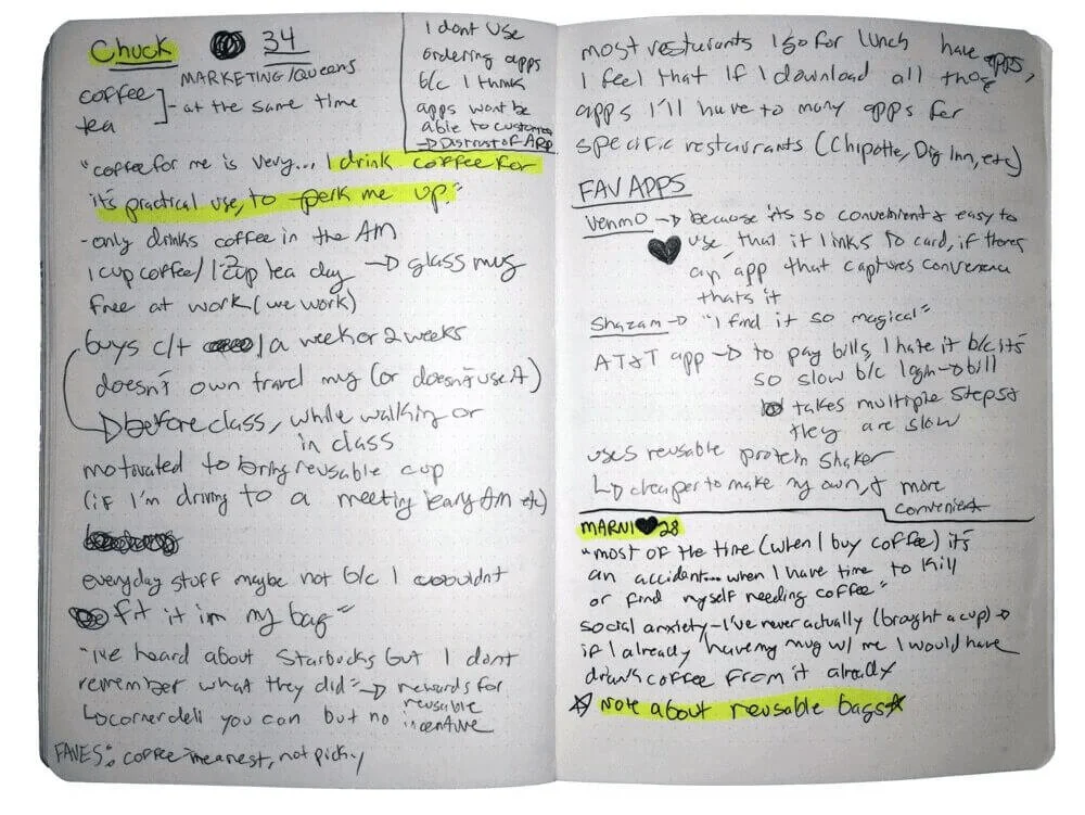
I interviewed 10 potential app users and conducted a Google survey that received 270 responses. Here are a few of the questions I asked:
On an average day, how many cups of coffee/tea do you usually drink?
In an average week, how often do you purchase “to-go” beverages?
Tell me about your typical experience buying coffee/tea.
Have you ever brought a reusable mug to a coffee shop?
From these conversations, I noticed a few themes:
Social Norms
“I don’t see a lot of people going into places with coffee cups so I feel weird doing it… it would have to be something the business was very aware of.”
- Marni, 28
Convenience
“I don’t usually use [a reusable mug] because it’s not convenient. I know that’s a terrible reason, but it’s just easier to order through the Starbucks app and go through the drive-thru to pick it up.”
- Meghan, 37
Habit
“For me it’s as easy as having a reusable cup I like and keeping it in my backpack. Once you get used to it, it just becomes habit and it’s not such a big deal.”
- Sara, 31
USER PERSONAS
I was surprised to learn that many people felt awkward bringing a reusable mug into a coffee shop. Others expressed concern that the barista would not know how to handle the situation. Having been on both sides of the counter (I worked as a barista after college), I never would have guessed this would be such a common feeling.
Based on the findings from my user interviews, I created user personas based on the most common themes. I thought about the main goal each user would have using the app and mapped out the task flows they would need to achieve these goals. Click through the slides below for more detailed profiles.
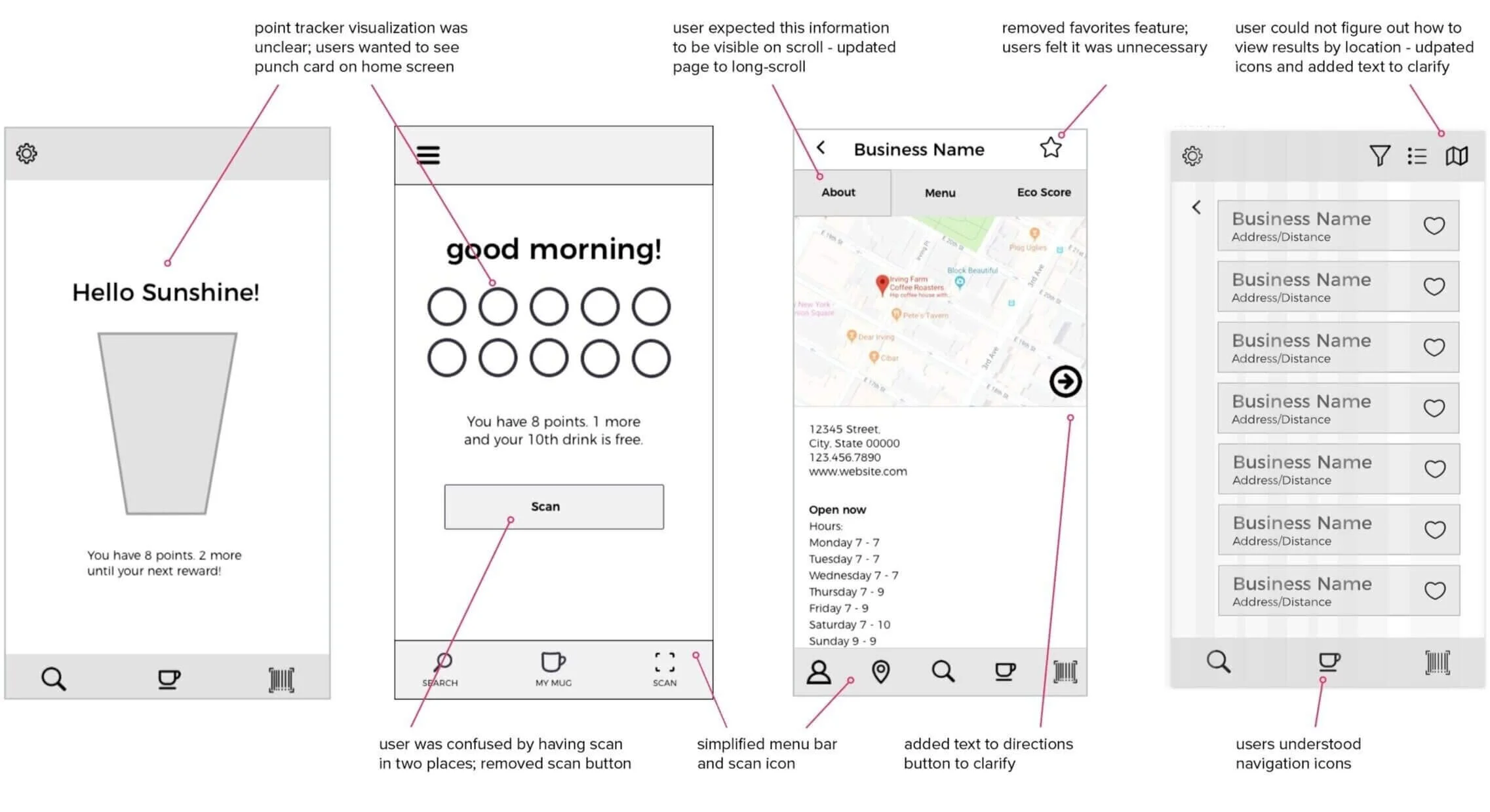
WIREFRAMES + user testing
My biggest takeaway from this project was how challenging it is to determine what other people will find intuitive. The most interesting example of this came from testing out the business search function. When I asked users to search for a business by name and by location, they were confused by the icons for switching between a list view and a map view. This is one of many features I was able to simplify.
VISUAL DESIGN + BRANDING
Now it was time to think about the brand identity and visual design for the app. I identified the key aspects of the brand personality: bold, urban, efficient, sustainable, and warm. These attributes inspired the visual style for the app.
BRAND implementation
If an app sits in the app store with no downloads, does it really exist? After designing MUGMUG, I extended the project to encompass the brand’s offline presence. Here are a few ways I would market MUGMUG:


