User Research
UI Design
UX Writing
In-house
The Ethyca Privacy Center is a portal through which end users (the business customers’ customers) can exercise their legal rights to download their data, delete their data, and manage the how their data is used.
Ethyca’s business customers can customize the Privacy Center with their company logo, a brand color, and custom text. Beyond these elements, the design is standardized across all Privacy Centers.
The goal of this project was to improve the Privacy Center experience within the existing page structure, without making changes to the back end or the overall user flow.
Privacy Center before and after. While subtle, the changes are there. Read on to learn about the reasoning and research behind the updates.
Make it pretty? not so fast…
This project started with a simple brief - if you could call it that. I wish I had a screenshot of the Jira ticket, but it said something to the degree of:
“The Privacy Center icons look dated and a bit [bleep]. Find some that look more modern and will work across all of our customers brands.”
As shown in in the image above, the main design feature of the Privacy Center is the icons. They represent the three actions a user can take: download data, delete data, and manage consent settings. Since the icons are standard for all customers, they need to fit in with a variety of brand styles.
I scoured the Noun Project for options to select a set of nice, minimal icons. Mission accomplished, right?
Updated icons, version 1
I shared them with the VP of product and expected her to be happy we could move on to development. Instead, she came back to me with the question of meaning—why these icons? The problem with the original icons wasn’t just the style: no one actually knew what they meant.
I realized that I needed to back up and focus on what the symbols meant, before thinking about style.
SURVEY SAYS…
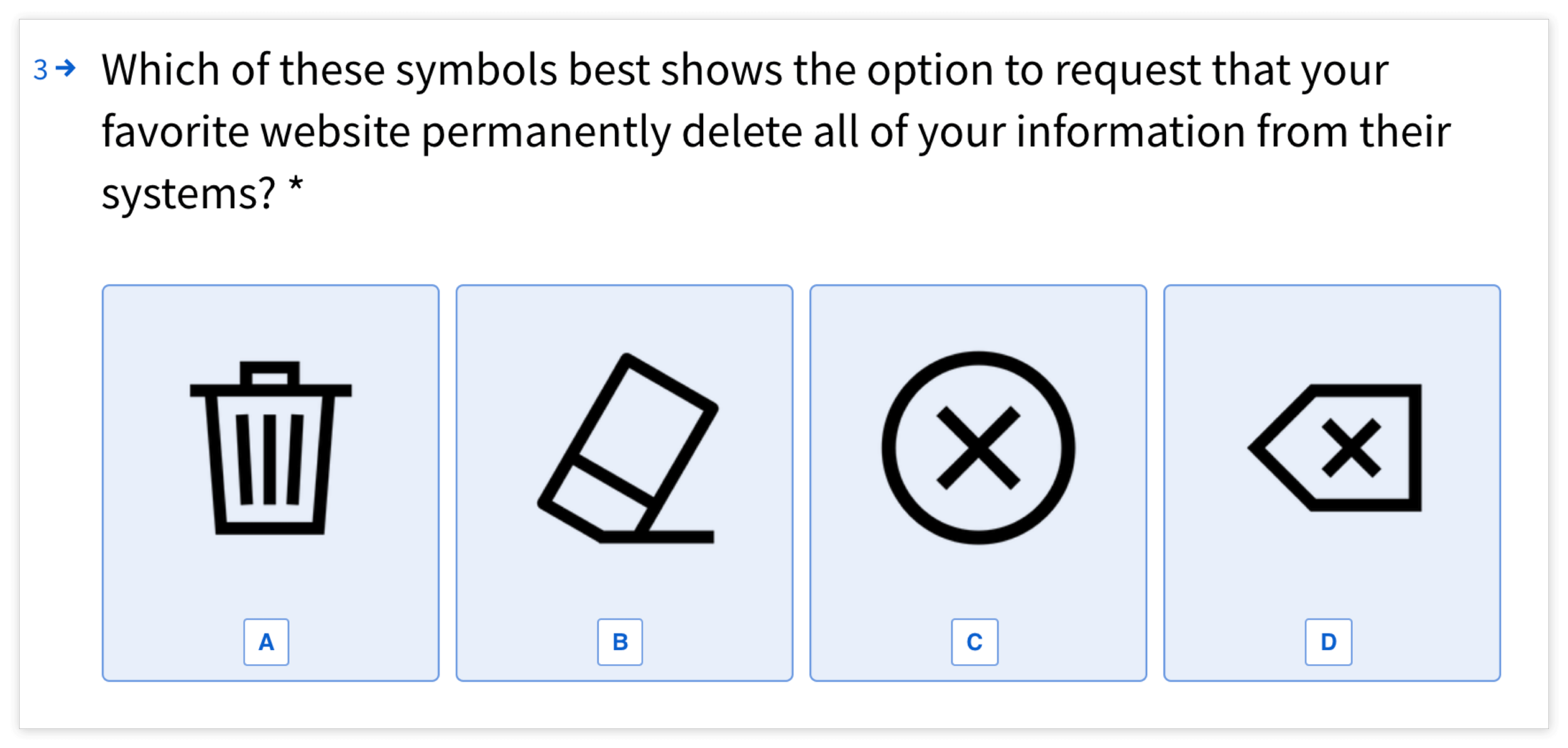
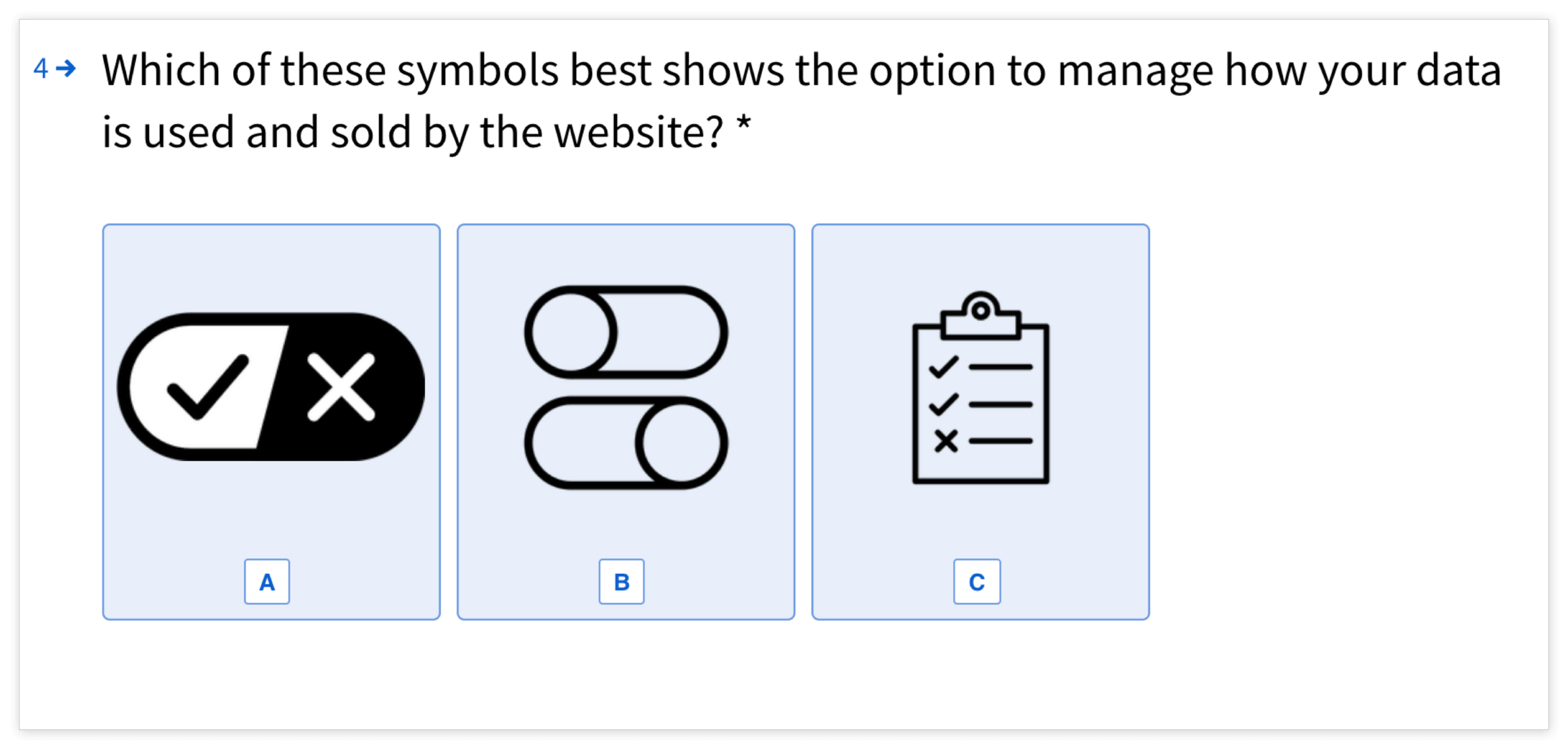
I first looked at other privacy portals and identified symbols that were commonly used for the Privacy Center actions. I narrowed down the most common options and then created a user survey to determine which of the symbols made the most sense for each action.
The icon choice for “delete my data” was clear: Out of 173 responses, 132 people (76%) said that the trash can was the best symbol to represent this action.
The responses for the “manage consent settings” symbol were split closely between the clipboard (75 votes) and the toggle (72 votes). The other option—the official California Consumer Privacy Act “opt out” icon—received only 26 votes.
After selecting the symbols, I used the Noun Project to find an icon style that was simple enough to work across a variety of brands. Using these base icons, I created custom icons of the symbols from the survey.
Due to time and resource constraints, I narrowed down the initial batch of icon options by myself. In an ideal project, I start out with the larger batch of icons and have users complete a card sorting exercise to learn what symbols held the most consistent and clear meaning. I would also extend my research to the language used on the page and A/B test different copy and icons.
digging deeper
As I went through the process of updating the icons, I realized that the overall experience of using the Privacy Center could be SO MUCH better. I identified and presented the following additional areas for improvement:
Even with new icons, the process was confusing. We needed clear calls to action and jargon-free copy.
Some sections did not meet basic accessibility guidelines. We needed to find a solution that would bring contrast up to standards
The fonts, sizes, and colors changed throughout the experience. We needed a consistent style for each piece of the process.
Clear Calls to Action
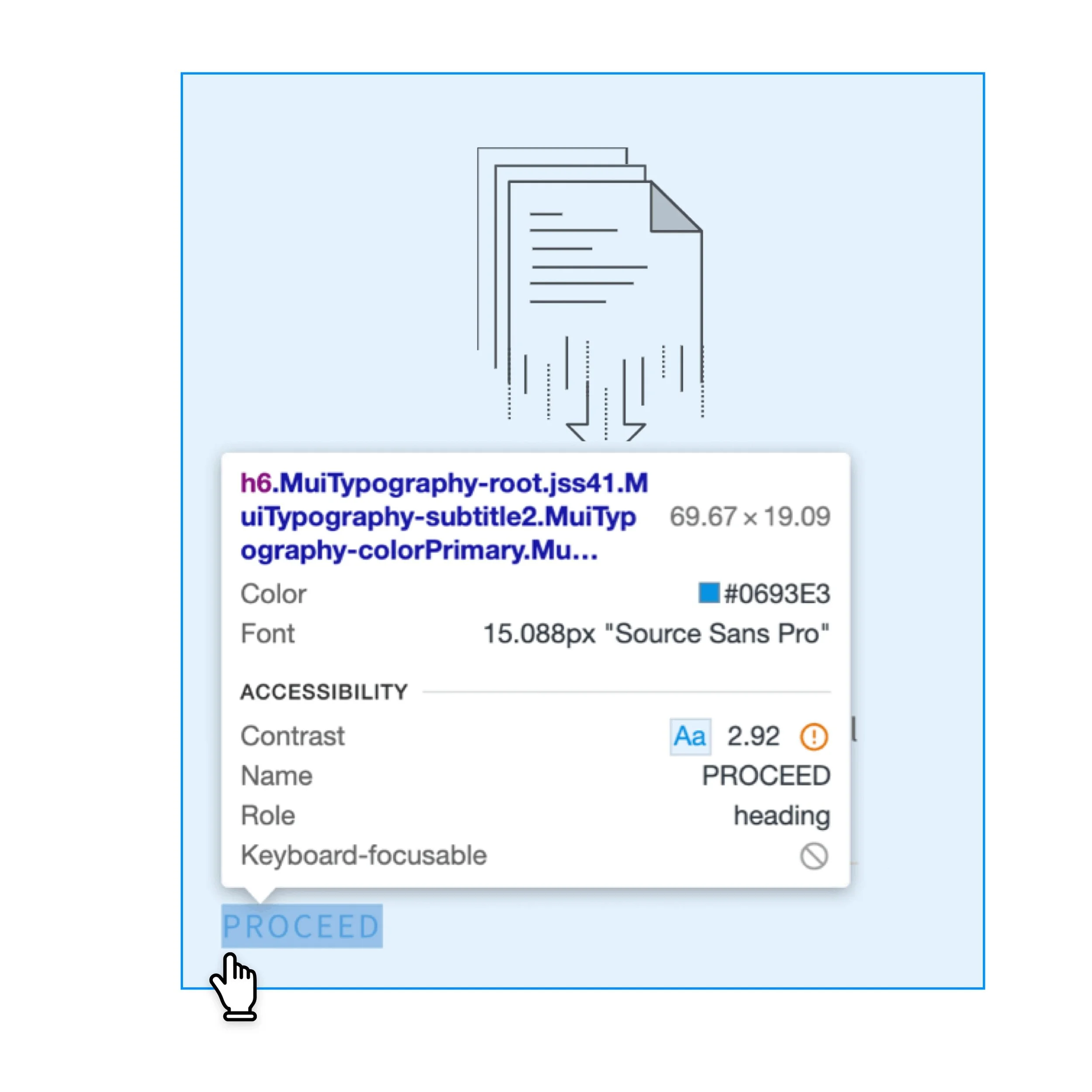
The buttons on the Privacy Center homepage were all vaguely labeled with the word PROCEED. This did not set the user up to know what to expect next. I updated the buttons with action-oriented text that clearly states what action is being taken.
Jargon-Free Copy
The original copy used language from the privacy regulations that many users would not be familiar with, such as “CCPA” and “Data Processing Activities.” In addition to being good practice, the use of “using clear and plain language” is actually a stated requirement in Europe’s privacy law, the GDPR:
I rewrote the copy on the Privacy Center homepage and modals in plain language that explained each step of the process. These are before and after examples of the modals the user encounters after clicking Download Your Data:
contrast (and constraints)
The original Privacy Center had problems with color contrast. The design used a light blue overlay to denote a hover state. The issue came with the customization: the clients could select their brand colors, and if they selected a light color or blue, the buttons contrast would not meet accessibility standards.
I updated the design of the hover state to use shadow to show which option was selected, rather than color. This helped mitigate the problem of the button text being obscured by the blue overlay.
Before
After
Ultimately, our control over the color contrast was limited, because the button text uses the brand color selected by the client. If the client selects a light color, the buttons will not meet accessibility standards. While changing the hover state wasn’t a perfect solution, removing the blue overlay helped decrease the likelihood of a contrast issue.
In a future version, there are a few solutions to ensure the client color selection meets accessibility standards:
limit the client’s color options to only colors that are legible on a white background
allow clients to customize the text and button colors independent from their chosen brand color
automatically add a dark background when the brand color is too light
There were similar problems with the buttons and toggles on the Consent Management screen. The primary action buttons defaulted to white text, no matter the background color. The secondary buttons were either white text on a light gray background or floating text with no background or border.
In the updated design, the text on the primary buttons automatically switches between black and white depending on a the button background color. `The secondary buttons are standardized: always white, with dark text and a dark outline.
CONSISTENCY
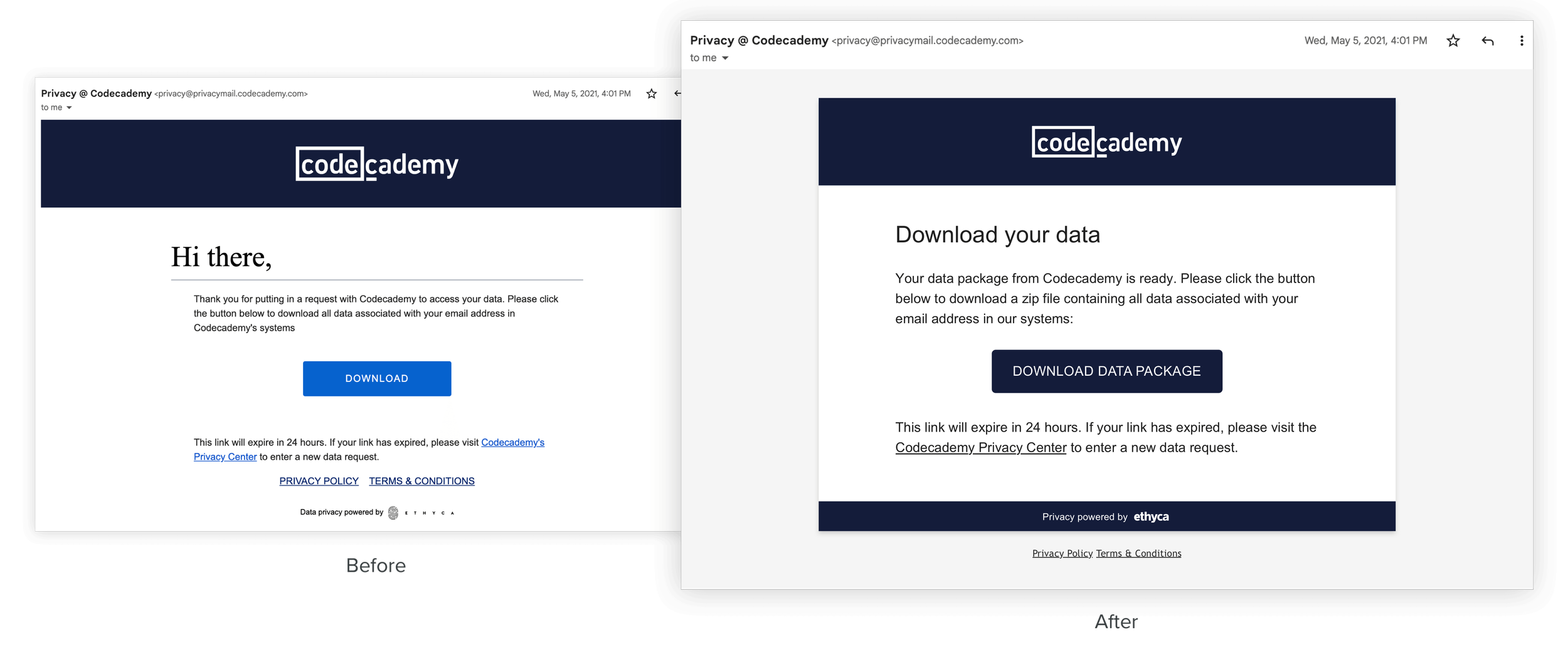
While interacting with the Privacy Center site, the user receives several emails. The design of these emails was all over the place in design—where did the 42 pt. Times New Roman headers come from? I updated the email design and copy to be consistent across all of the emails in the series and also rewrote the copy with “plain language” in mind.
mission accomplished
Since the Privacy Center data ultimately lived in the client accounts, I was not able to access data to measure performance. However, if I could measure, I would want to know:
Quantitative
What happened to the number of completed requests? What about abandoned requests?
What happened to the amount of time it took a user to complete their request?
Did users contact the company with questions about the process? If so, did the questions change? Did the number of questions decrease?
Qualitative
What words would people use to describe the process of using the original Privacy Center? What questions would they have? And how did this change with the updated Privacy Center?
Learnings
I learned a lot from the short user study we did, and I can’t wait to dig deeper into that process in the future. I enjoyed having the opportunity to take an existing design, research and suggest improvements, and then implement the changes throughout the full user journey in the both design and UX writing. The “refreshed” Privacy Center is easier to understand, more consistently designed, and it ultimately meets the original brief of looking nicer than the original.
TL;DR
Meaning must come first —“pretty” can follow. Doesn’t matter if something looks nice if no one can tell what it means.
People won’t always do what you think they will do, which is why you have to ask them ;) I love learning what people find intuitive and how they think differently than I do.
Plain language makes the experience better for everyone, and the process of translating from jargon can help identify pain points in the experience.
When elements are out of my hands, such as with a white-label product, I need to design for the “worst case scenario” to ensure usability and accessibility.
Watch the quick video below to see the updated Privacy Center design live and in action!
